Days 1 and 2
Day 1: Moodboard
The first day in the Graduate Diploma of Creative Technology (specialising in Graphic Design) was a day of learning about the course ahead with getting our accounts sorted out on the computers and having a quick run down of the basics of Graphic Design.We received our first assignment for the course. We have to make a moodboard about our interests in colour, Typography, the art we like and about ourselves. I used InDesign to produce the moodboard as it has guidelines and margins that will give structure to the layout of the pages by keeping equal spacing and perfect alignment for the images. I chose InDesign over Illustrator as InDesign is optimised for page layout across multiple pages.
Below you can see my moodboard:

The art board above has illustration work from Frank Frazetta, Jim Lee, Stanley "Artgerm" Lau, Johannes Helgeson and Burgerfuel (The company). The watercolour art style by Frank Frazetta is so captivating, he is able to make wonderful drawings and paintings of fantasy worlds. Jim Lees comic work with both DC and Marvel Comics is always wonderful to see, he has a unique process for doing his work and the outcome is inspiring.
Stanley "Artgerm" Laus illustration work is jaw dropping and can be seen on many comic book covers. His illustrations are almost realistic and are very beautiful. Johannes Helgeson has a unique digital art style that I have not seen done by many other artists. The Burgerfuel burger is an illustration piece that inspires me to improve in my illustration work. Their shirt illustrations take on their own personal branding and combine that with popular culture.

This colour page collects a combination of colours that contrast and suit each other well and that I personally find are interesting to look at.

The typography page has a collection of fonts and typographic styles that I have found interesting, inspiring and designs that I feel will push my design skills further through practice.

The personal board is a collection of images that describes my interests.

This final page is a collection of images that portrays the level of Graphic design work that I want to achieve at the end of the course. I am striving to achieve well designed books, logos, marketing material and product/packaging designs.
Now that I have a complete moodboard identifying the my interests the next assessment is to create an infographic that visualises who I am.
Disclaimer: all the images above are not mine and have no relation to me at all. I take no credit for these images
Day 2: Grids and Layout
Day 2 focused on looking at the history of Graphic Design, where Graphic design has come from and where it's going, how it began and the evolution and development of different design movements.
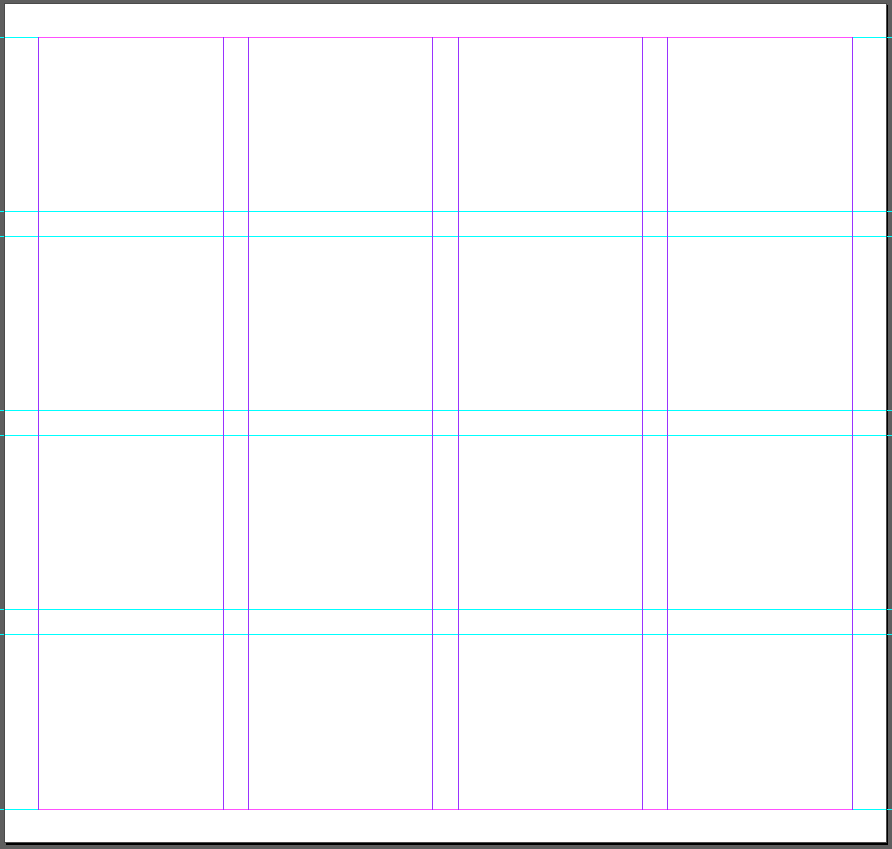
The practical work for the lesson was on Grids and Layout in InDesign. The main focus was on laying out text in a 4x4 grid layout, with margins and gutters for spacing. The text hads to been on three different pages each page with a different layout and font. One page is allowed to have a different font size. One design then needs to be finalised with paragraph/character styles.
Below is the grid layout before the text has been added and then the various layouts of typography.
Below are 5 layouts with grey space to illustrate where images or other content can fit in. I have added a trim border so it's easier to see where the printer needs to cut the page. it also helps define the page in an image.


After receiving feedback and criticism on the typographic work there were a few things that needed to be changed. The most clear is that the grey boxes, even thought they define the empty space of the page, does not show the grid layout well hence forth they need to be removed.
The next few changes were to a single piece (below). The main heading does need to be clearly defined so it stands out from the other sub headings. The heading could be extended out along the top and the font size increased. For the sub-headings they could be bullet pointed or Italicised to show the difference between them and the main heading.

Below I finalised this design idea. I wanted to play around with the heading and paragraph ,that goes with it. I extended the heading and paragraph across the top and made the Heading a lot larger. It now stands out a lot and the reader will know what the page is about. I italicised the paragraph to show that it's an intro into the subject that is on the page and not part of the "Common Typographic Diseases".
This design could be be better balanced if there were more columns and rows to separate the paragraphs.

I wanted to play around with the layout some more after doing this project and quite liked one of the other students idea of vertical wording.


These last few designs are interesting. The orientation of the heading demands the viewers attention especially when it is large and goes from top to bottom. However the positioning of the text in the centre of the page, as seen in the second design feels out of place. to improve upon that in the future I could shorten the heading on the side and make space for the text below the heading like in the other designs.
The last design is interesting however the sub headings for the each paragraph doesn't sit right perhaps a different arrangement could help with this.
The next post I will be doing is part of a Summative that is about investigating and studying layouts and grids within 3 different forms of printed media.
Thank you for reading.


Comments
Post a Comment