Logo Evolutions Topic 3
This weeks study topic is about logo evolution. I will be studying the evolution of the Canon, Adobe, Ford and BMW logos. Each one has a different and interesting story behind them and each had a similar goal, to represent that they want to be at the top in their fields.
The Canon camera is a well known and famous brand, however few would know the evolution of their logo. In 1933 Precision Optical Instruments Laboratory was founded, the name would soon change to Canon. The first camera called the Kwanon was prototyped in 1934 along with the logo of the buddhist Goddess of Mercy. Soon afterwards the logo was changed into text, this form is a lot simpler and at the time it would have been similar to the Coca Cola logo in terms of the swooping tail of the "n". In 1935 the logo would be revised again and changed to a design that is similar to the one we know now.
In 1953 the font of the logo is given a more stylised shape, the letters are narrower, bolder and are given more definition. The font has been touched up to have sharper detailing on the ends of the letters. The evolutionary stages of the logo have been from a complete design change to making the design more pronounced.
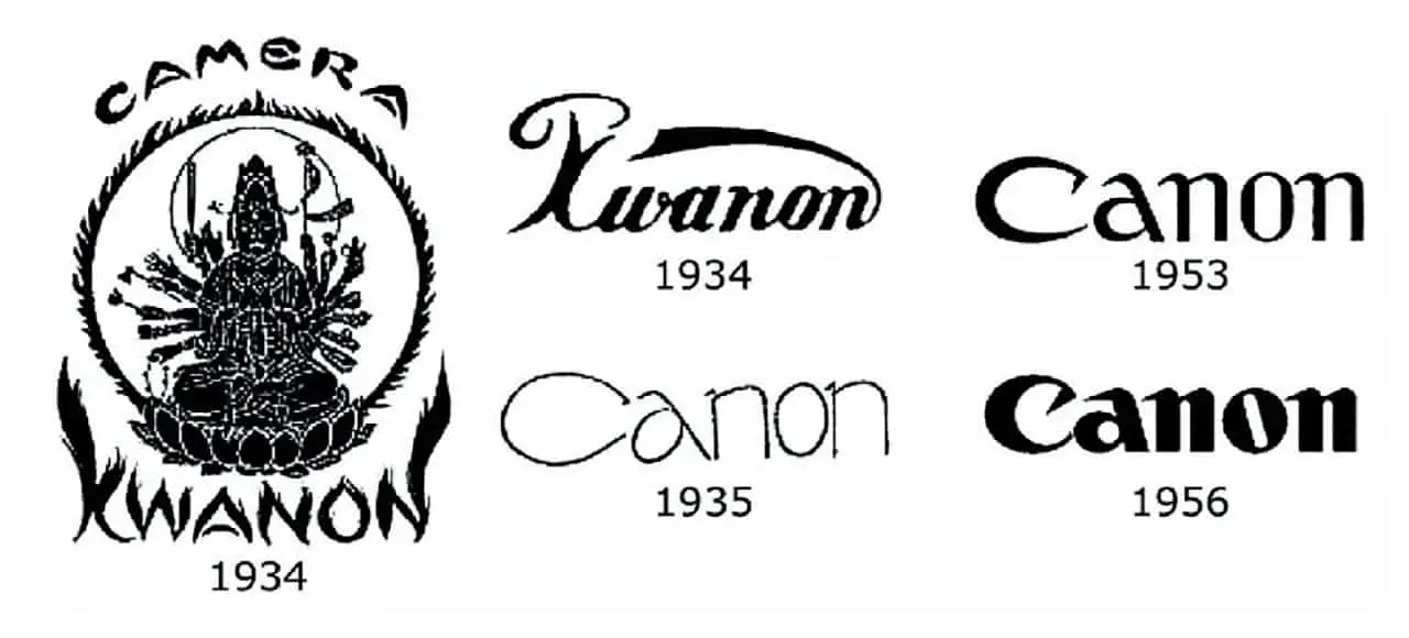
The first two logos were changed to meet the companies goal of being a large global company that will be relatable to a wide target audience, from businesses to a households. Changing the logo from the Buddhist Goddess to the now known Canon logo was a good move as it made the logo more simple and easier to read and removing any religious connotations.
The next logo evolution I'll be looking at is the Adobe logo which was developed in 1982 by the co-founders wife. The alteration to the logo in 1990 was just simplifying the logo with the removal of "Systems Incorporated" from the bottom and making the "Adobe" text black without a background. This change would have been keeping with design trends at the time while being simple and it keeps the brand looking stable and trustworthy with the strong font and design of the text.
The change in 1993 saw a change in the font type but the logo kept the A from the original logo to keep the branding consistent. This could have been a move to bring the brand into a modern era of design and keeping the logo fresh with roots to its predecessor.

The next logo evolution is the Ford Motors logo. The Ford logo has been through nine changes so far, the biggest changes were between 1903 to 1917 after then the changes were minor adjustments and refinement of the logo itself. The icon font type (Henry Fords signature) was first released in about 1909 and has been kept since then.
The first logo was just an emblem with "Ford Motor Co. Detroit, Mich" which was fancy and elegant in design however Henry Ford wasn't pleased with the logo. He wanted a logo that would convey "professional authority, reliability, and affordability" which is when the oval around the signature was developed in 1911, thanks to European designers. From 1911 onwards the logo had small alterations done such as the shape adjustment and colouring to fit in with the times.
The logo from 1912 was a logo that was implemented only in America for a short period before it was changed to the oval design.

The next logo evolution I will be looking at is the BMW logo. The evolution of the BMW logo originated, not from the propeller of a plane as commonly thought but from the the Bavarian Free State colours. The outer ring of black where the letters "BMW" are situated is influenced by the Rapp Motor logo which was the former aeronautical engine company, that Franz Josef Popp, the founder of both companies, at the time.

Throughout the development and life of BMW the logo has had little changes to it's design, the main appearance remained the same. The first design had "BMW" in the black ring with gold a outline and font colour with the Bavarian colours in the middle. The design then changed to having thicker outlines for the rings and letters, the original design was kept the same. This change would have made the letters stand out more, making it more legible from a far.
The colour and lettering changed in the 1950s from gold to white for the aeroplanes and silver for motorcycles and cars. By 1960 the font type was then changed and implemented into all their products by 1966. In the 70's and 80's BMW tested out a different logo for the motorsport series where the standard logo was surrounded by their motorsport colours. In the late 70's the logo changed again to having bolder letters, for their printed material the logo would be shown in a 3D design.
I believe all these changed were to make the logo look fresher while still having the same design since the brand is very popular and well known.
Canon - https://global.canon/en/corporate/history/01.html
https://www.spellbrand.com/famous-canon-logo-origin-evolution
Adobe logo - https://1000logos.net/adobe-logo/
Ford - https://inkbotdesign.com/ford-logo-design/
BMW - http://bmwmcmag.com/2013/01/origins-of-the-bmw-logo-and-the-spinning-propeller-myth/
The Canon camera is a well known and famous brand, however few would know the evolution of their logo. In 1933 Precision Optical Instruments Laboratory was founded, the name would soon change to Canon. The first camera called the Kwanon was prototyped in 1934 along with the logo of the buddhist Goddess of Mercy. Soon afterwards the logo was changed into text, this form is a lot simpler and at the time it would have been similar to the Coca Cola logo in terms of the swooping tail of the "n". In 1935 the logo would be revised again and changed to a design that is similar to the one we know now.
In 1953 the font of the logo is given a more stylised shape, the letters are narrower, bolder and are given more definition. The font has been touched up to have sharper detailing on the ends of the letters. The evolutionary stages of the logo have been from a complete design change to making the design more pronounced.
The first two logos were changed to meet the companies goal of being a large global company that will be relatable to a wide target audience, from businesses to a households. Changing the logo from the Buddhist Goddess to the now known Canon logo was a good move as it made the logo more simple and easier to read and removing any religious connotations.
The next logo evolution I'll be looking at is the Adobe logo which was developed in 1982 by the co-founders wife. The alteration to the logo in 1990 was just simplifying the logo with the removal of "Systems Incorporated" from the bottom and making the "Adobe" text black without a background. This change would have been keeping with design trends at the time while being simple and it keeps the brand looking stable and trustworthy with the strong font and design of the text.
The change in 1993 saw a change in the font type but the logo kept the A from the original logo to keep the branding consistent. This could have been a move to bring the brand into a modern era of design and keeping the logo fresh with roots to its predecessor.
The next logo evolution is the Ford Motors logo. The Ford logo has been through nine changes so far, the biggest changes were between 1903 to 1917 after then the changes were minor adjustments and refinement of the logo itself. The icon font type (Henry Fords signature) was first released in about 1909 and has been kept since then.
The first logo was just an emblem with "Ford Motor Co. Detroit, Mich" which was fancy and elegant in design however Henry Ford wasn't pleased with the logo. He wanted a logo that would convey "professional authority, reliability, and affordability" which is when the oval around the signature was developed in 1911, thanks to European designers. From 1911 onwards the logo had small alterations done such as the shape adjustment and colouring to fit in with the times.
The logo from 1912 was a logo that was implemented only in America for a short period before it was changed to the oval design.
The next logo evolution I will be looking at is the BMW logo. The evolution of the BMW logo originated, not from the propeller of a plane as commonly thought but from the the Bavarian Free State colours. The outer ring of black where the letters "BMW" are situated is influenced by the Rapp Motor logo which was the former aeronautical engine company, that Franz Josef Popp, the founder of both companies, at the time.
Throughout the development and life of BMW the logo has had little changes to it's design, the main appearance remained the same. The first design had "BMW" in the black ring with gold a outline and font colour with the Bavarian colours in the middle. The design then changed to having thicker outlines for the rings and letters, the original design was kept the same. This change would have made the letters stand out more, making it more legible from a far.
The colour and lettering changed in the 1950s from gold to white for the aeroplanes and silver for motorcycles and cars. By 1960 the font type was then changed and implemented into all their products by 1966. In the 70's and 80's BMW tested out a different logo for the motorsport series where the standard logo was surrounded by their motorsport colours. In the late 70's the logo changed again to having bolder letters, for their printed material the logo would be shown in a 3D design.
I believe all these changed were to make the logo look fresher while still having the same design since the brand is very popular and well known.
Canon - https://global.canon/en/corporate/history/01.html
https://www.spellbrand.com/famous-canon-logo-origin-evolution
Adobe logo - https://1000logos.net/adobe-logo/
Ford - https://inkbotdesign.com/ford-logo-design/
BMW - http://bmwmcmag.com/2013/01/origins-of-the-bmw-logo-and-the-spinning-propeller-myth/


Comments
Post a Comment